For the “Biography of a Map” assignment a number of students selected various maps of Pennsylvania. Happily, at least for my pedagogical experiment, they all strove to understand how these maps functioned for William Penn and Thomas Holme, Penn’s surveyor and cartographer. Students placed the maps into the context of Penn’s religious, political, and economic life. Students examined three early maps of Pennsylvania: A Map of some of the South and Eastbounds of Pennsylvania in America, being Partly Inhabited (1681); A Portraiture of the City of Philadelphia in the Province of Pennsylvania in America (1683); Mapp of the Improved Part of Pennsylvania in America (1687).
In approaching these maps, students all tried to see them as more complicated than merely faithful representations of geographic space. As one student wrote: “Maps are not simple reflections of the world around us, but they are complex representations of a space and often leave room for multiple significant interpretations.” Students tried to see Penn’s maps as a form of propaganda or as promotional material. Yes, these maps represent geographic space, but they did so along with other information and in a way that “served to ease some of the fears of wilderness, entice people with the promise of abundance in land and resources, and demonstrate the civilized nature of the young colony.”
One component of this assignment asked students to provide a 200-word caption for the map they studied. The goal was to compell students to distill their report down to the most important point. The descriptions below come from those 200-word captions.
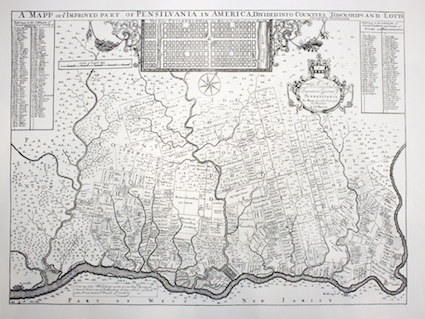
Mapp of the Improved Part of Pennsylvania in America (1687)
This is the earliest county map of south eastern Pennsylvania. In addition to the counties, it shows the many townships, the number of settlements in each township, and lists the prominent land holders and where they own property. Philadelphia occupies just a small space at the bottom of the map, so Thomas Holme, perhaps at Penn’s urging, enlarged the plan of the city and inserted at the top of the map:

The students who worked on this map located it squarely in Penn’s colonialist project:
In 1681, William Penn required a map of his new Province of Pennsylvania. He needed the map to display the lands purchased by his fellow colonists, who those fellow colonists were, and where Philadelphia fit in among their plots. The map also had to be accessible to prospective European colonists curious in buying land in the New World. Thomas Holme, Penn’s Surveyor-General, was commissioned to design it. Over the course of several years, Penn sent out deputy-surveyors to collect data on smaller portions of Pennsylvania. This collage of measurements were compiled to form the Mapp of the Improved Part of Pennsylvania, Divided into Countyes, Townships, and Lotts. The map exhibits fine attention to detail by recording the name of every landowner in 1680s Pennsylvania. It includes an insert of Holme’s earlier plan of Philadelphia, A Portrait of the City of Philadelphia. The map is also rotated clockwise 45°, presenting the Delaware River as a horizontal boundary to make the rest of the map easier to read. Large empty spaces are included in the upper reach of the map to entice prospective colonists into purchasing plots in Pennsylvania.
Another student described it as
Penn’s effort to promote and establish his holy experiment. The map depicts the degree of thought that was put into the organization of the colony as shown by straight lined plots, names of credible settlers, organized county lines, available fertile land, and a clearly planned city located off a large river at the heart of it all. Holme’s map provides assurance that Pennsylvania was not the landscape of terrifying wilderness as was reported by early settlers of the new world [sic], but a civilized colony that had the resources provided by wilderness with the security and structure of a civilized society.
One student saw the map as Penn’s effort to record his “accomplishments as a proprietor—showing ample progress in building a province in just six years—and as a work of art [that] present[s] the province as an inviting place, depicting navigable waters, fertile soil, and fresh air—ultimately urging emigration to this new land.”
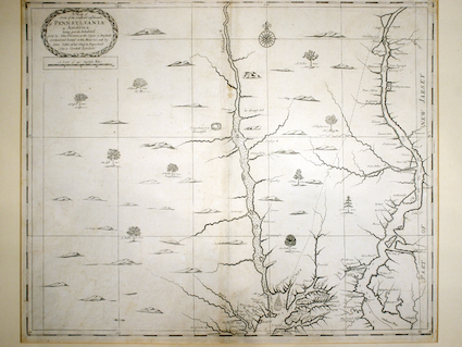
A Map of some of the South and Eastbounds of Pennsylvania in America, being Partly Inhabited (1681)
Students again saw this map as functioning on multiple levels. It was, to be sure, a representation of geographic space, But as with his later map of Pennsylvania, here he carefully selected both what to represent on the map and how to represent it. Penn’s selection of information to include on his map reveals how it too served to advance his economic venture, his effort to establish a colony and to sell property. Like his later map of Philadelphia, this one illustrated a letter describing the colony: A Brief Account of the Province of Pennsilvania in America, lately granted under the Great Seal of England to William Penn. This letter outlines the land, its laws, living conditions, and how much the journey costs and how long it takes. Clearly this map was intended to sell people on Penn’s new colony.

In 1681, William Penn received the Pennsylvania charter. To make money, he needed land buyers so [he] began an extensive campaign to advertise Pennsylvania and its unsettled lands. His project included commissioning cartographers John Thornton and John Seller to construct a large map of Pennsylvania to sell in shops throughout Britian.
The map’s title mentions Pennsylvania is “partly inhabited” so potential settlers know there is plenty of unsettled land available for future development, and they know people have been able to live there so residing in Pennsylvania is a realistic possibility. Homesteads and properties have large, legible labels with their owners’ names, which imply to viewers that individual are important to society because so many names are visible on a big map. The map also depicts the wilderness as harmless, filled with rolling hills and common trees so potential settlers feel comfortable with the idea of dwelling in Pennsylvania. The map does not present Indians, which many Europeans feared, as a threat; instead, it shows the Indian “Sasquahana Fort demolished” and an “Old Indian Field.” Both examples suggest the decline of Indian presence.
Thornton and Seller presented Penn with a useful propaganda map to subtly encourage people to purchase Pennsylvania land.

A Portraiture of the City of Philadelphia in the Province of Pennsylvania in America (1683)
Like his previous map, Penn’s map of Philadelphia illustrated a marketing letter. This letter was addressed to the Free Society of Traders and outlined the physical geography and environment of the province, the natives and their customs, and discussed land usage.

The unfolding of a new, primarily Quaker settlement, is revealed in a 1683 map of the developing Philadelphia, Pennsylvania. It reveals a developmental method for provinces and cities. After receiving the land as repayment for debt by King Charles II, William Penn set to work strategically placing the city of the province between two navigable rivers and gaining purchases of the plots of land. The map was made by Thomas Holme, the surveyor-general of the territory to be accompanied with a long and descriptive letter by Pen to The Committee of the Free Society of Traders about the ecology and native peoples of the province. Holme’s position as surveyor-general both lends credibility to the document and detracts it because he knew the land very well but was also personally invested in its success. It is a small map; black and white because it is a print and shows a grid-like plan for the city, with eight streets generally running east to west and twenty streets generally running north to south. The map’s purpose beyond relaying information is its important role as a confirmation and validation for those who had purchased plots, aiding the communication between two business parties.

A number of plots along both rivers as well as along High Street had been sold. Lists in the letter name the purchasers of these plots and how much additional land outside Philadelphia they had purchased. Plots in the city were allocated according to how much total land the person purchased.

I am quite happy with how students approached these maps and tried to make sense of them. They seem to see maps as pregnant with meaning and signification. What is represented on a map is not accidental but serves the purposes and goals of the map maker and the person who commissioned the map. They seem to be applying a version of E.H. Carr’s advice to study the historian before studying the facts, they are listening for the bees the mapmaker has in his bonnet, to use Carr’s more colorful formulation. I am eager to see if I can get students to move on to further layers of analysis, worrying about the physical details, e.g., the size of the map, that it was part of a letter rather than just a large sheet of paper, how much it cost, etc. Perhaps other students, working on other maps moved in those directions. In a subsequent post I will look at some of the other work to see how well students achieved the goals I set for the assignment.
[Originally posted at the PACHS blog.]
3 replies on “Marketing a Colony—William Penn’s Maps of Pennsylvania”
[…] Haverford College’s Special Collections is about to open a new exhibition titled “You Are Here: Exploring the Contours of Our Academic Community Through Maps” (more information is here). I was asked to write a caption for James C. Prichard’s ethnographic maps that accompanied his Natural History of Man (1843). Here is the draft of my caption. The exhibition will also feature some student work from my Introduction to the History of Science course, see here. […]
[…] I pointed to student efforts to understand William Penn’s maps as marketing propaganda, “Marketing a Colony.” Other students produced interesting analyses. One student examined William Dugdale’s […]
[…] Students were able quickly to see maps as more than neutral reflections of the natural world, see Marketing a Colony—William Penn’s Maps of Pennsylvania. At the same time, students had to confront some unfamiliar challenges, see Mapping Our Way […]